***
Last March of the Dodos
It was another productive week for Dodos. We've added some minor new features to round out the experience more, though they're still not totally polished. First, there's now a countdown at the beginning of every level to give the player just a bit of extra time to scope out the layout before the Dodos begin their march. This allows for more intentional strategy, but it does not kill the frantic experience of having to adjust and manage the birds in real time--best of both worlds! I designed the look, transitions, and timing of the countdown and worked with Kamron as he implemented the feature. Also, I created the art assets (the numbers and text art) for this--sometimes the best help I can give is to just do whatever needs doing, even if it's not necessarily my particular focus.
Second, there is now an achievement system in place! As we've come to learn for ourselves (as well as from our new production and publishing faculty member, Amy Adkins), achievements are necessary for this type of game (if not every type). The system is still quite early in development, but the framework is there. Things will really start moving once we've finalized all the levels and can determine all the unique things we'd like to challenge the player to accomplish. I helped design where the visual elements would appear as achievements are earned, as well as what types of achievements will be in the game, while Derek created the framework and engineered how the system will work.
We also continued work on the UI and menu design. Christine is doing a great job with the art, and I've been designing where the various elements should be located and how the functionality works. Even with the relatively simple changes we've made so far, the game already feels quicker and more streamlined to enjoy.
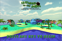
Further, we've constructed our new splash screen, and the invitation to play is far more appealing because of it. I guided I Kamron in what to do with the level model, rotating camera, and title logo. We're happy with how all these additions are bumping our game to the next level.
Finally, I've started figuring out how to use HanSoft, a common software tool in the industry for managing the game development process. Amy has been helping me understand the ins and outs of the software, and I've started transferring our dev process for Dodos to it. The real trick will be getting the team on board if we decide that it will be official. Either way, it'll be a great skill to have under my belt for the industry.
The Leonardo Project
Our pre-production phase is moving ahead and nearing its close. We've had several meetings to discuss our individual research and determine what the necessary pieces of the game will be. Roger has been guiding these design meetings based on a new approach that he's devised: a figurative box made of four walls--the tech wall, the audience/theme wall, the aesthetic wall, and the gameplay wall.
Part of my duties has been to take pictures of our whiteboard notes, then interpret them and share them with the team via our Google Drive. It's helped to keep everyone aware of any different directions we take from meeting to meeting, especially for those members who haven't been able to attend every time.
This week, I was tasked with researching public art and museum exhibits to determine what exactly was the draw--the hook--for each one. Based on the dozens of pieces I investigated, we determined a number of things that help these types of experiences stand out:
- Touch and/or physical movement involved in the interactivity
- Scale is important, even if the size is inconvenient for some
- Interactivity results in immediate feedback, so users know just what they've done to the exhibit
- If it's a game, the goal(s) should be made evident to the players, even if they still have the option not to contribute to that goal
- It should aim to generate some conversation, if not outright controversy
- It should be an experience that is situated and unique, something they can't get anywhere else
- Finally, within the limited time that people spend at such exhibits, they need to be able to 1) prepare for the game, 2) learn and understand how to play it, 3) play it sufficiently, and then 4) reflect on the experience and contribute to the conversation.
To begin the week, we had a meeting to get our development process started. We broke down the game design into user stories and tasks, and we then began our first sprint. As part of the meeting, I helped explain the newly adjusted design details (as of last week's completed design document) to all members of the team so that we are all on the same page and can determine a clear direction for developing those features.
For my responsibility this week, I was assigned the task of designing and documenting the various user stories relating to enemy AI (including the AI for Void, the boss enemy), plant and environmental interactions, and what the upgrade Elements do for the player and the gameplay.
The engineers are hard at work learning how to use UDK and have started developing features based on the user stories. As long as we keep to our schedule, we should be able to reach our goal!
Little has happened since last week, other than keeping up with all the team members to track any progress that's been made. As expected, once classes started, it has proven difficult to keep steady progress on volunteer projects. However, it's still definitely alive, and this weekend's Global Game Jam should provide some great advice, experience, and understanding of developing on Ouya.
***
I hope to have a bit of news on my side design projects by next week, so keep checking back!
- Troy


No comments:
Post a Comment